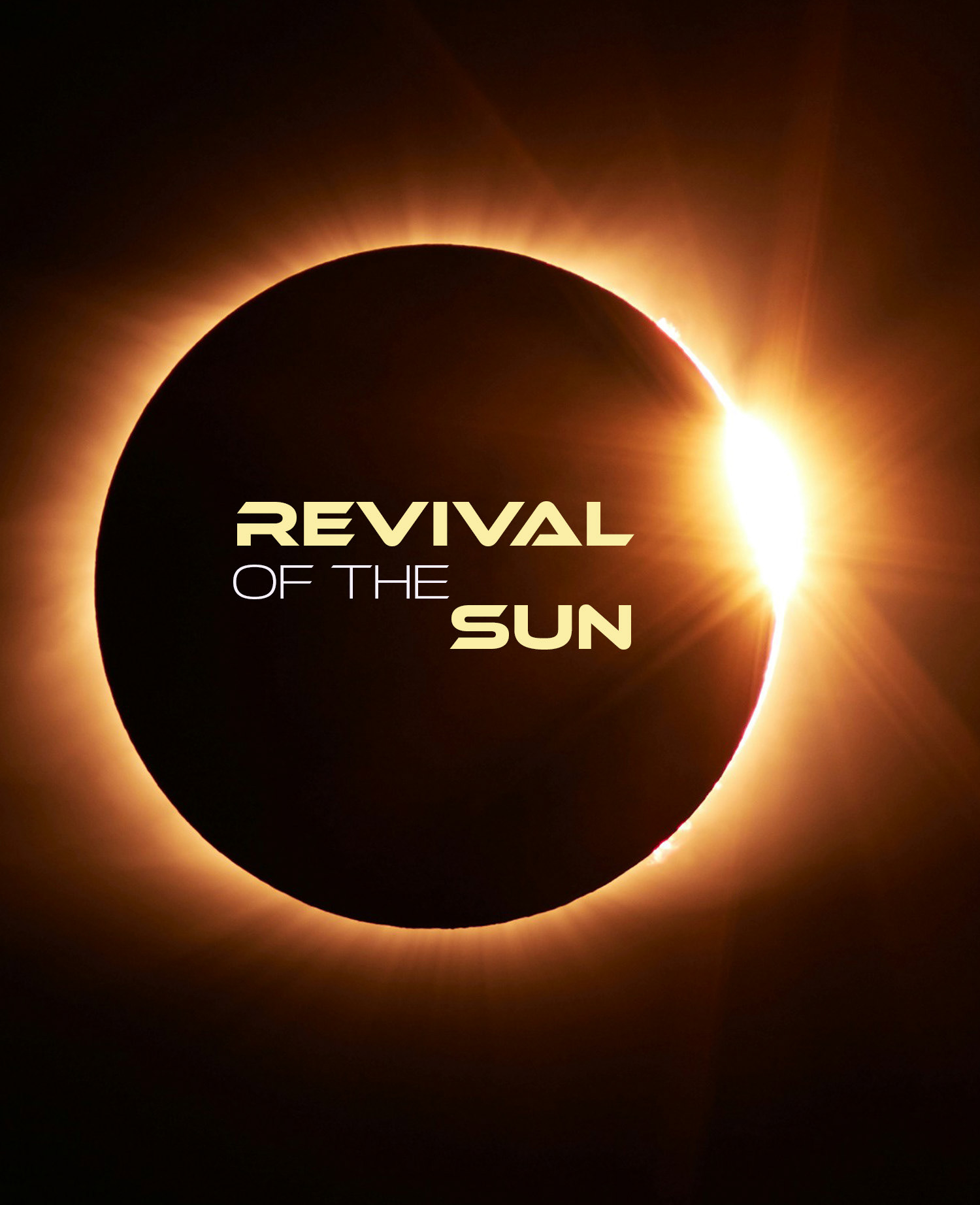
Context
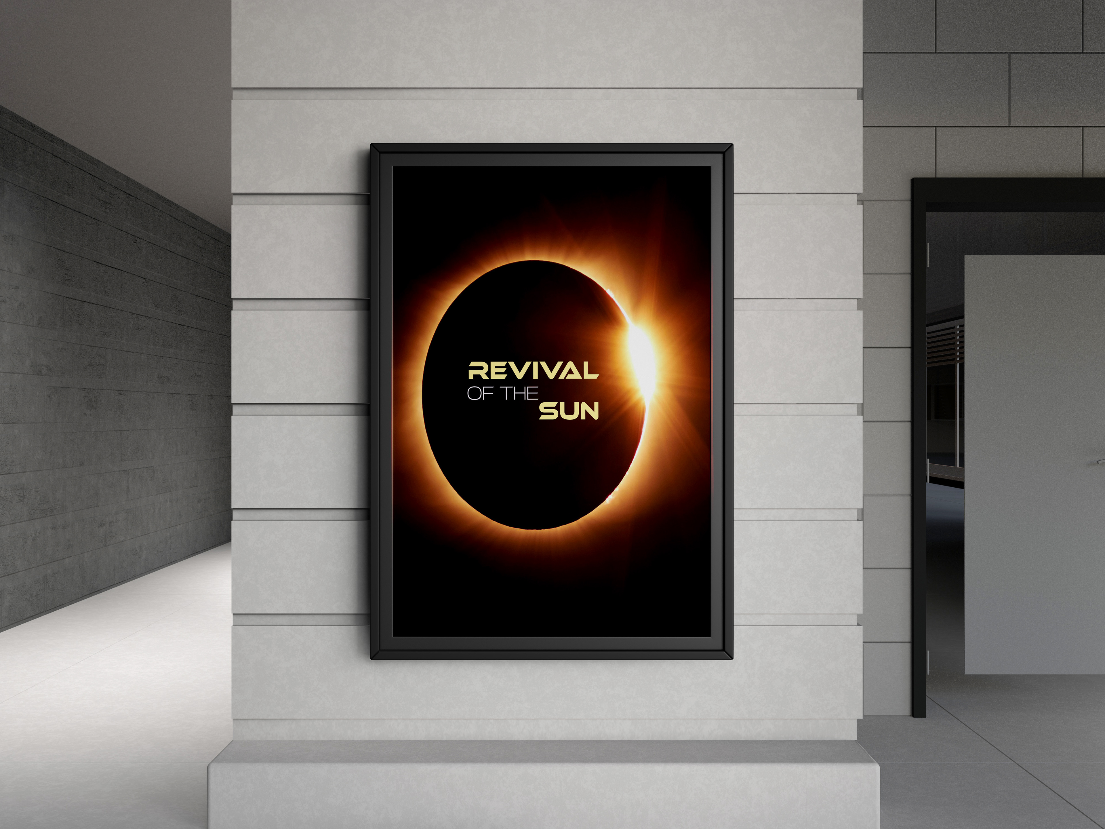
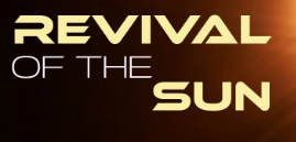
For a yet another simple exercise in our "Design 2" class, we made to make a Netflix title for a fake movie/series to demonstrate of use a title/typography lock up. After generating a small range of movie titles from a literal "Move Title Generator" website just linked in the exercise, I quickly across "Revival of the Sun" which already sounded amazing, and got to experimenting with text. So cool Sci fi move title it was.
Problem and Solution
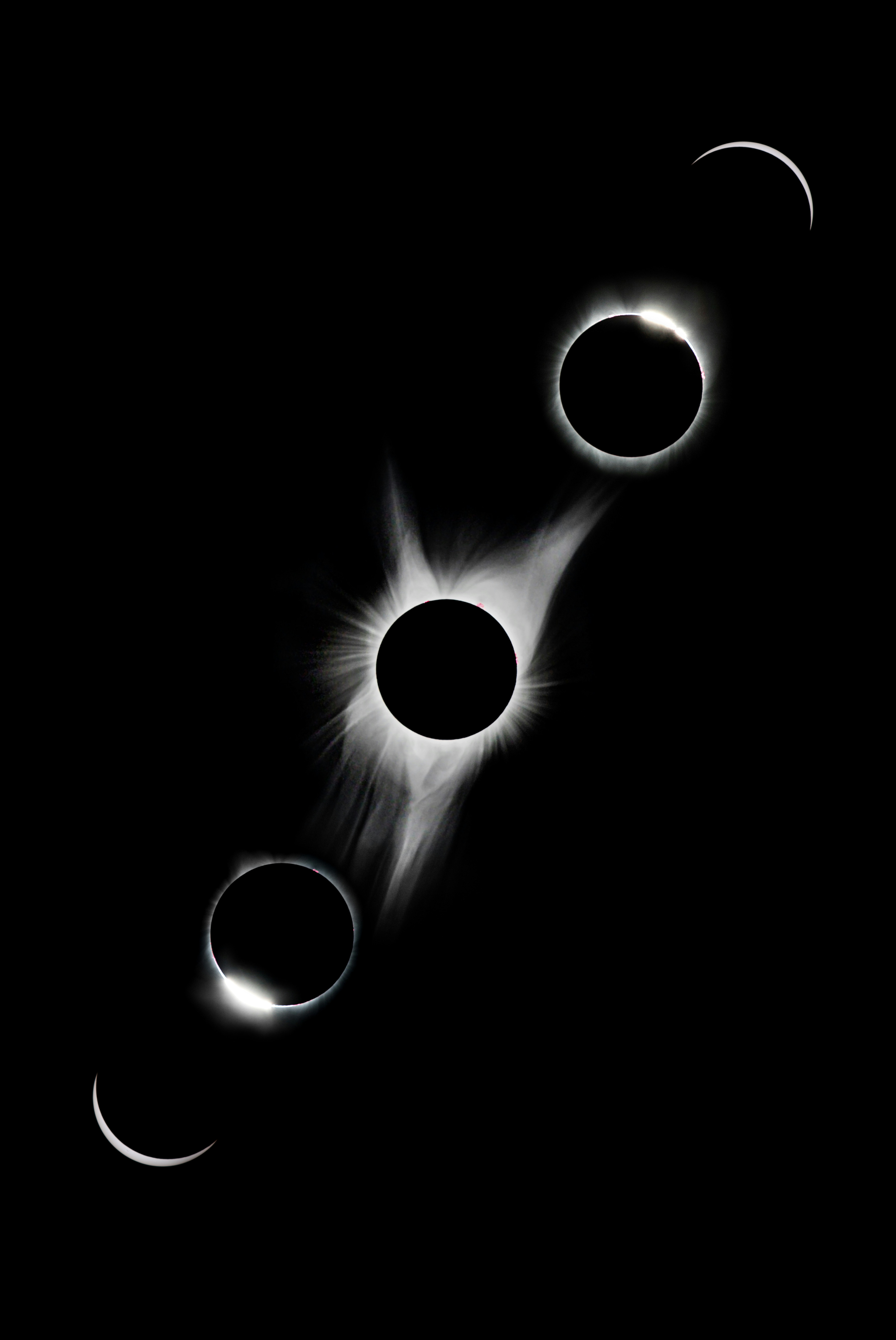
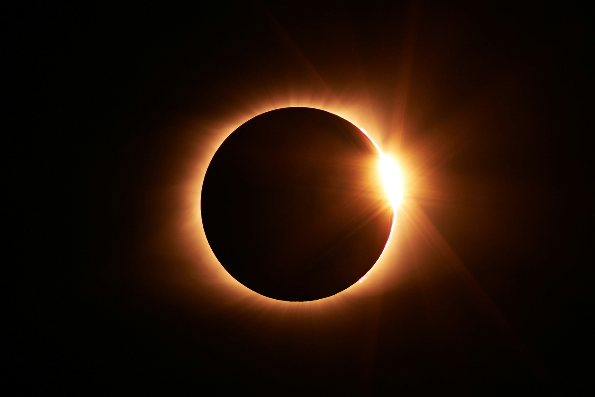
For much like the "Jam and Dog Biscuits Sale" poster redesign, all of my problems were already solved and thus, didn't have a real solution. (I could the text itself but you'll find in the "Process") That is, until I came across a simple background image to use for the title, I chose three of these images you see here but didn't know which one, so I went and got feedback from both my dad and brother who opted on using the 3rd image, so I did.

Process:
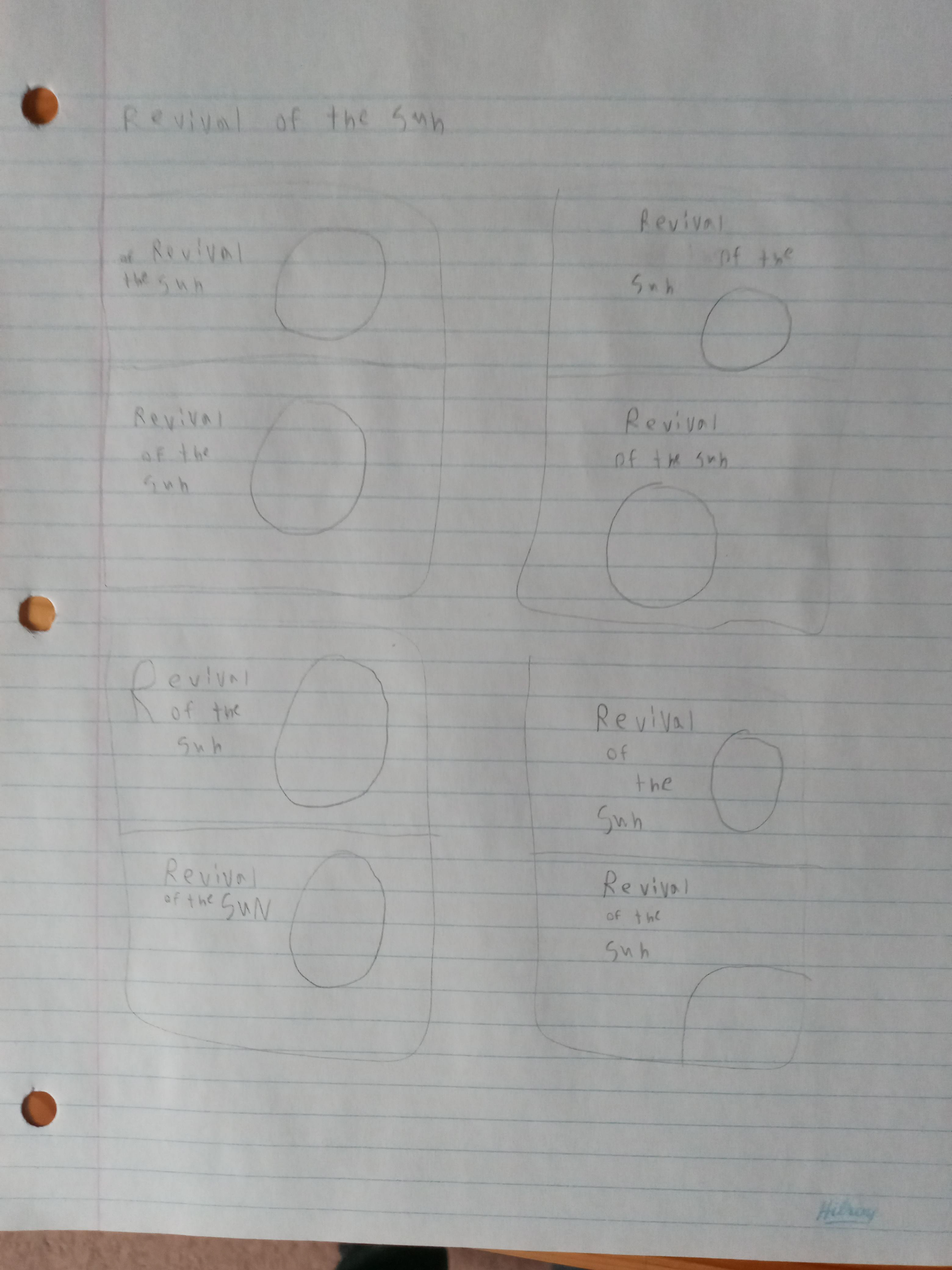
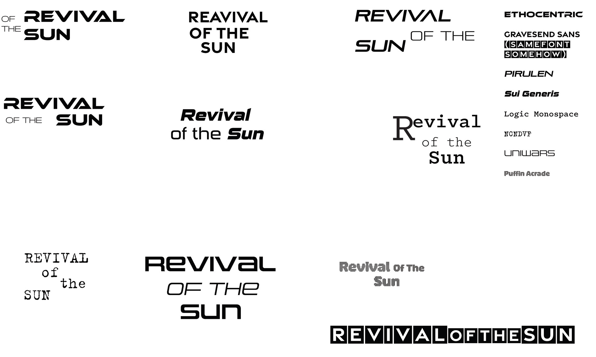
Sketching some ideas was fine, but actual "Roughs" of the title itself was interesting, since I never really played around with so many different typefaces and fonts and hierarchy before, it was fun nothing really stuck out to me expect for the first typeface and fonts I used on the top left, since "Ethocentric" was such a fun and cool sci fi typeface to use, although "Pirulen" and "Uniwars" were up there too.
On another note, I got one last piece of feedback other from my dad; who suggested to sample a pale yellow from the image I used on to the text, which worked out flawlessly.
Results:
One of the projects that I've been most happy with in a good while, and while I've noticed that I technically got the required dimensions wrong and that I can taste the pixels on the image I used, I still love it. My dad even said that he'd be interested in something like this if it was real, so I think I did my job well.